When I’m at a bookstore, I can spend hours staring at the books on the YA shelves. I literally salivate when I walk the aisles thinking of which books I’m going to read next and how nice my book is going to look one day when it gets its own cover and it’s sitting pretty on the shelf next to the others.
One book, Zombies Vs. Unicorns, has a cover that has always sucked me in, so naturally, one day I finally broke down and bought it. When I say “sucked me in” what I really mean is that I couldn’t stop coming back to it no matter how hard I tried to ignore the little zombie and unicorn duking it out on the front and the super cool illustration in the background. That really says something about the cover, doesn’t it?
Being an artist of the graphic design persuasion, I fully understand the point of cover art so I get seriously peeved when someone misses the mark and, conversely, I do a mental happy dance when they get it right. I also get a good kick out of classic covers that are redone as part of some huge marketing campaign like this one that was redone for Wuthering Heights. (Bet you can’t guess where it’s hanging out on the shelves):
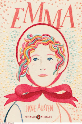
Really, though, I do enjoy redesigned books covers. The Penguin Threads Classics cover redesigns by Jillian Tamaki that are coming out in October of this year are some serious eye candy. You might have to shield your eyes from their stunning gloriousness.
Also, I might have to buy them just for the pretty.


No comments:
Post a Comment